Loading... Please wait...
- Home
- Color Palettes
Color Palettes
COLOR PALETTES
![]()
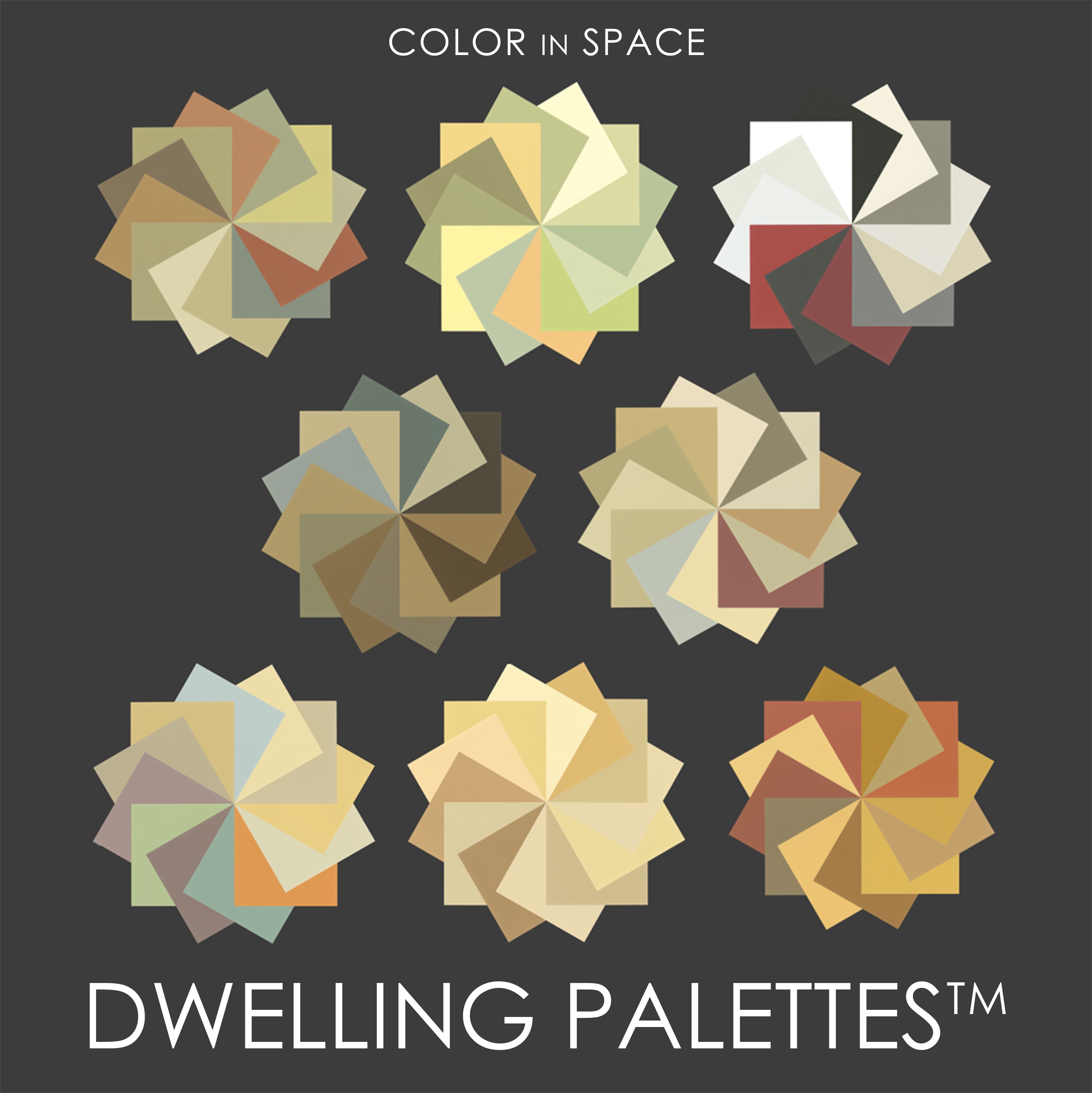
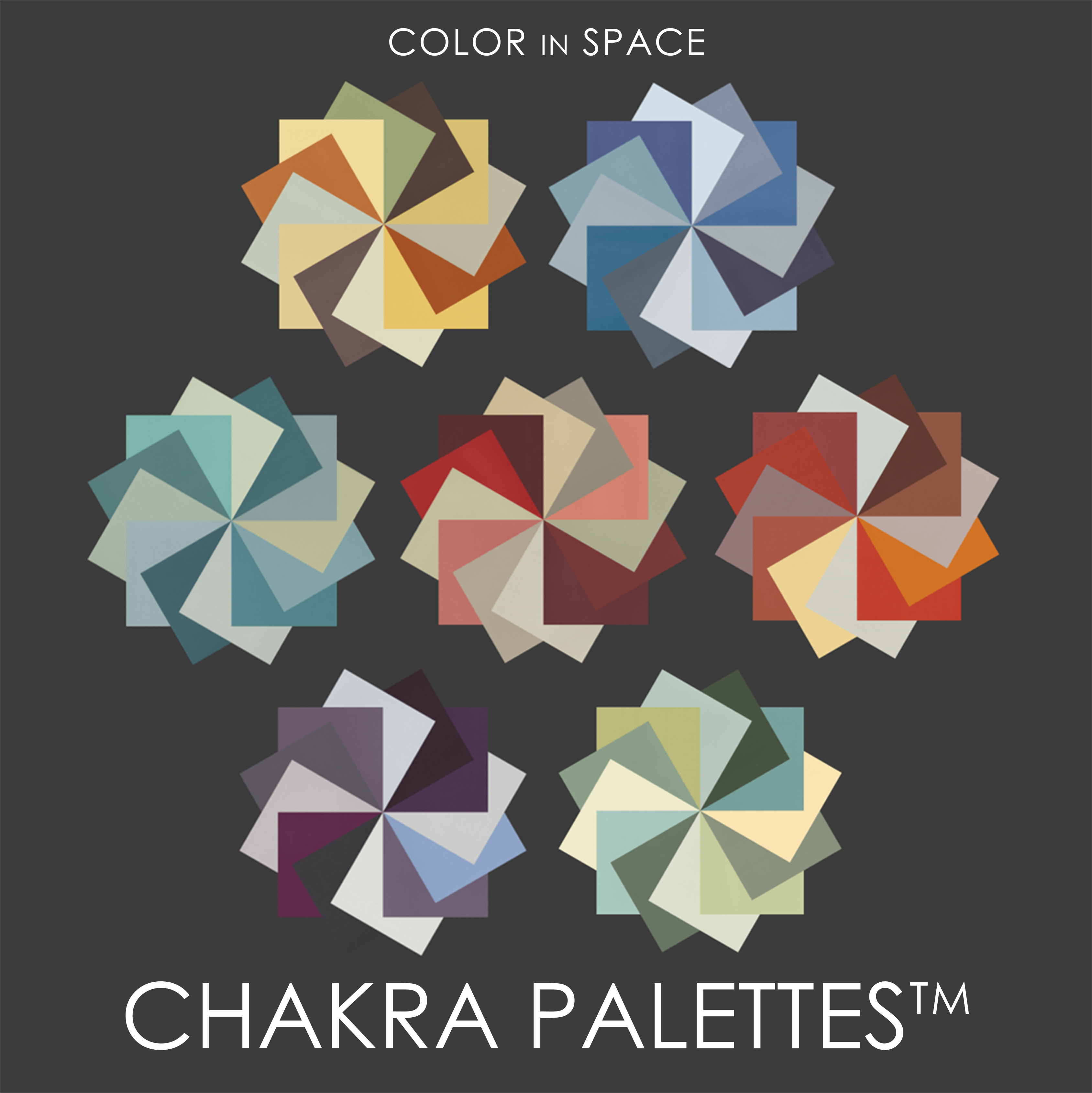
Color in Space has created three series of customized color palettes to make designing your home that much simpler. Each palette consists of 12 coordinated Benjamin Moore® Paint colors in useable, isolated swatches and no colors are repeated. The intentional selection of the twelve colors ensures that they are energetically balanced to support you in experiencing the best feeling spaces.

Make your home harmonious
Using the Color in Space approach means that the twelve colors in the palette may be used as the roadmap for your entire interior. Don't just think of the swatches as paint! One color could work as your sofa, another as the rug, and another as a dominant color in a piece of art.
Don't stop there, use them to guide the tile on the backsplash in your kitchen too! You will then have the confidence that the color you choose from the palette for the paint will certainly flow with the other decor items and architectural finishes you have. The twelve colors complement each other and overall create a very harmonious atmosphere.
Three ways to purchase and receive Color in Space Color Palettes™:
-
Get a complimentary Color in Space Palette™ when you purchase a Virtual Consultation for $150.
SHOP DWELLING VIRTUAL CONSULTATIONS SHOP MOMMA’S VIRTUAL CONSULTATIONS SHOP CHAKRA VIRTUAL CONSULTATIONS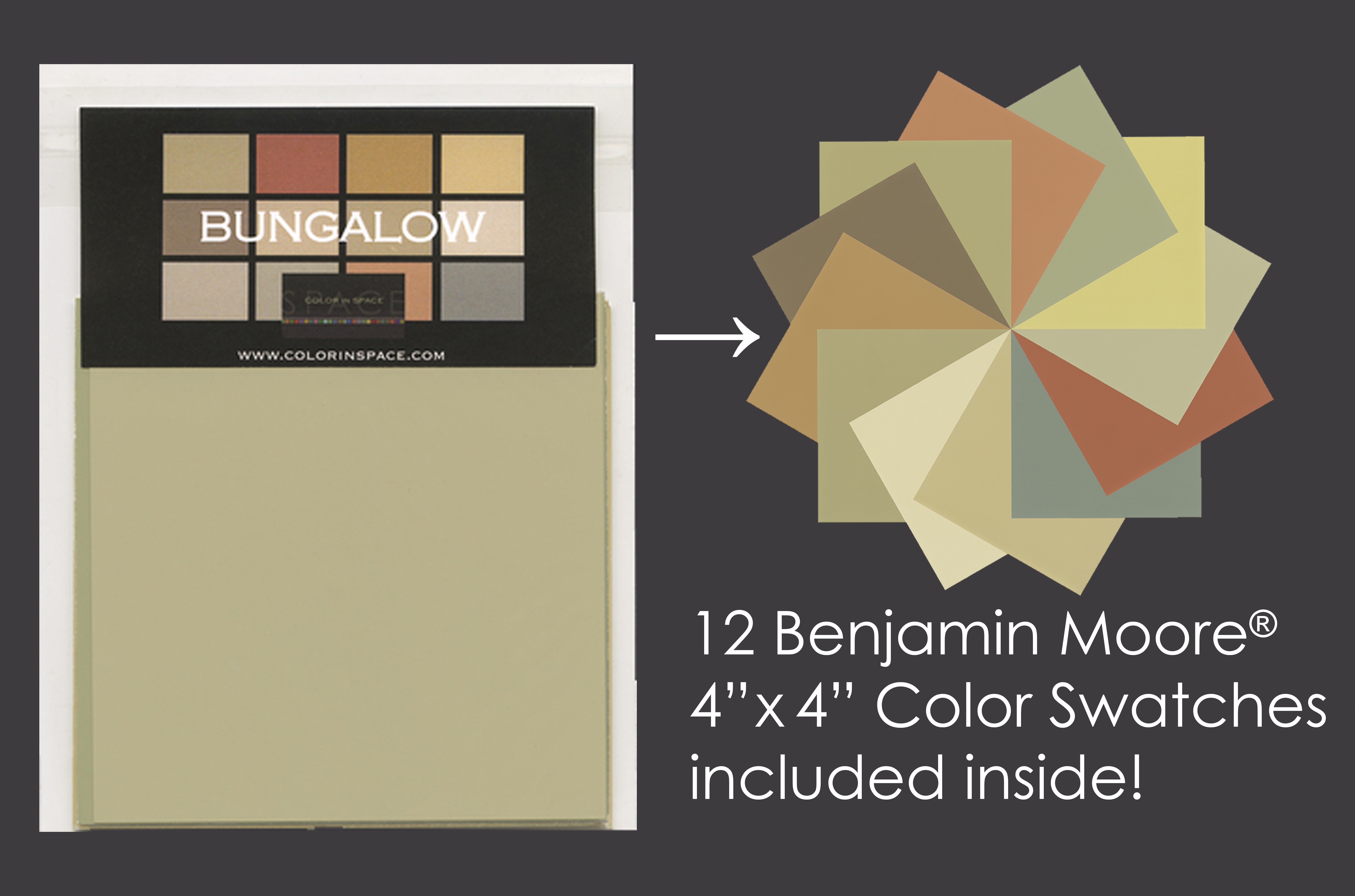
-
Get a complimentary Color in Space palette when you purchase a Virtual Consultation Package starting at $300.
SHOP VIRTUAL PACKAGES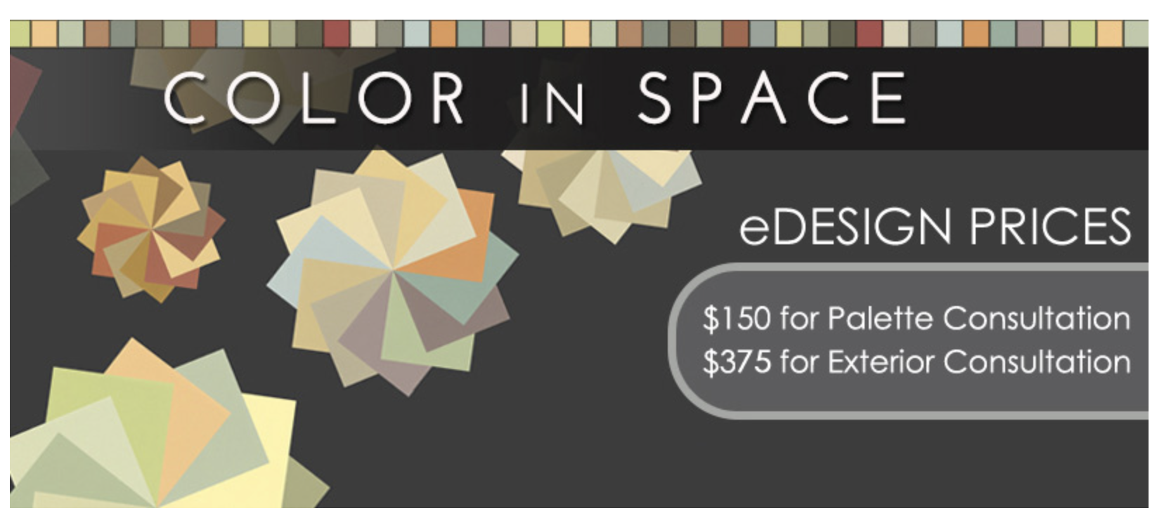
-
Purchase a palette for $25 and receive twelve 4” x 4” naturally balanced Benjamin Moore® Paint swatches through USPS within one week.
SHOP DWELLING PALETTES SHOP MOMMA’S PALETTES SHOP CHAKRA PALETTES & ART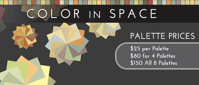
In a hurry to receive the color palettes? The palettes ship within 1-3 business days from receipt of the order and will typically arrive to you within one week from the date of purchase. If you are wanting the names and associated paint brand numbers sooner, we are happy to email you the information upon special request after receiving your order. Please email info@colorinspace.com for special rush requests after you have placed your order.
Grounded in physics and nature, our method simplifies what is divinely complex.
Color is light reflected and absorbed.
Colors’ appearances fluctuate and change in response to light, and more importantly, in response to adjacent colors and finishes.
The Color in Space Method™ capitalizes on this natural phenomenon—metamerism—offering a unique approach that begins with the selection of your color palette. In music, the key determines the rules for how the notes relate to create a song. The selection of your palette establishes the key for the colors of your home.
Color in Space utilizes these customized color palettes to make designing your home that much simpler. This method has proven successful for 20 years and is now being employed by color consultants throughout the United States and Canada. The magic is in how the colors relate to one another—the metamerism—so that they hum and sing.
Each palette consists of 12 coordinated Benjamin Moore® paint colors in useable, isolated 4” swatches. You will receive your palette as a complimentary tool for the consultation. The intentional selection of the 12 colors ensures that they are energetically balanced in the same way we experience color in nature. They harmonize in a subtly natural way to soothe your nervous system and soul.
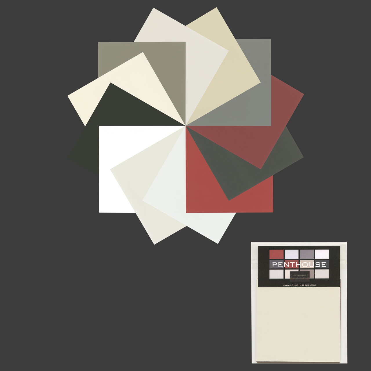
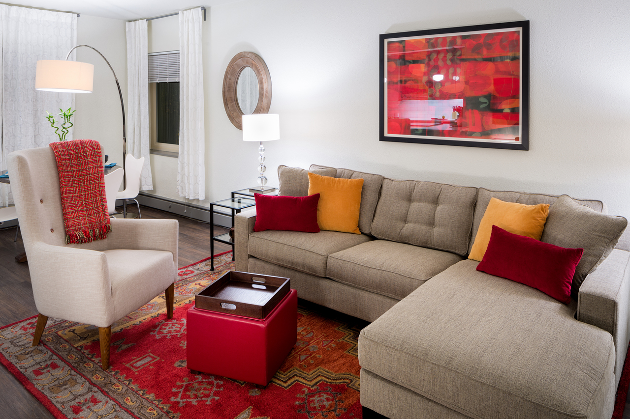
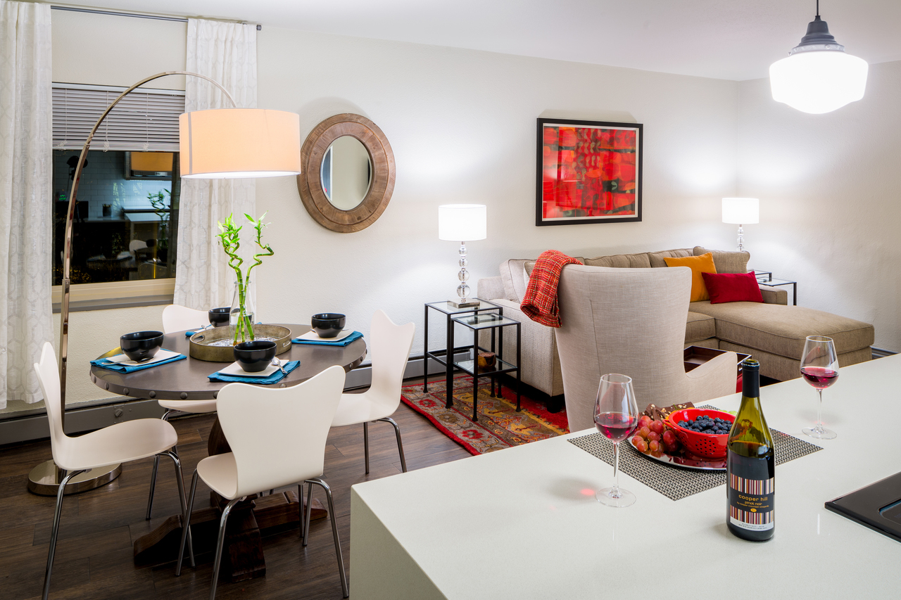
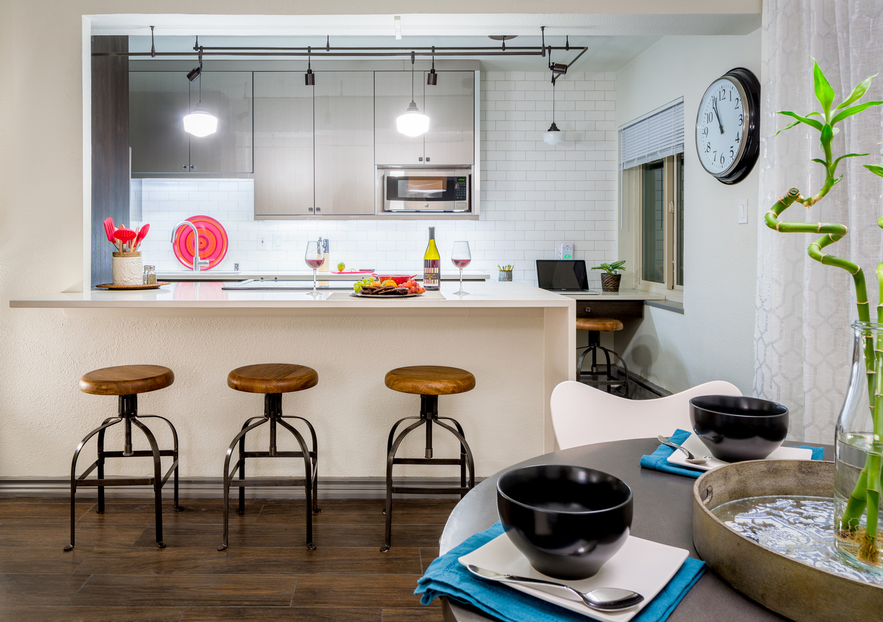
Here are examples of projects that were created from Dwelling Palette™ Consultations: the Penthouse Palette™ and the Bungalow Palette™.
PENTHOUSE DWELLING PALETTE™ CONSULTATION
This condominium in downtown Seattle was completely renovated and the design was entirely created from the guidance of the Penthouse Palette™.
All of the paint colors used in the condominium are from the 12 Benjamin Moore® Paint colors included in the complimentary Penthouse Palette™. This project used five of the 12 colors in the palette for paint.
The other swatches assisted us in selecting all of the new hard finishes: flooring, tile, two different kitchen cabinet finishes, carpet, and countertops.
Bringing the palette with us, when we were acquiring new décor for the living room and bedroom made finishing the project a snap!


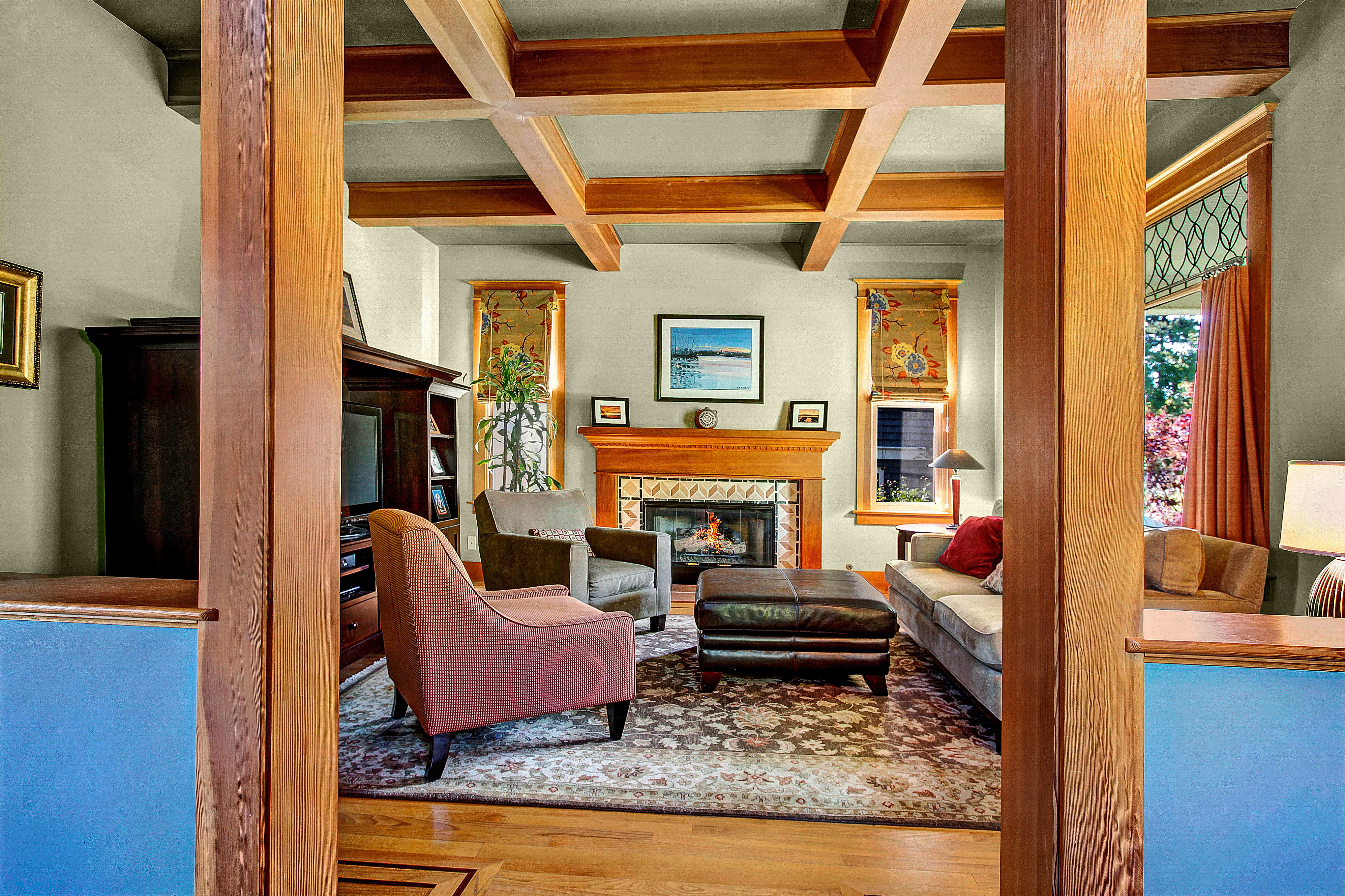
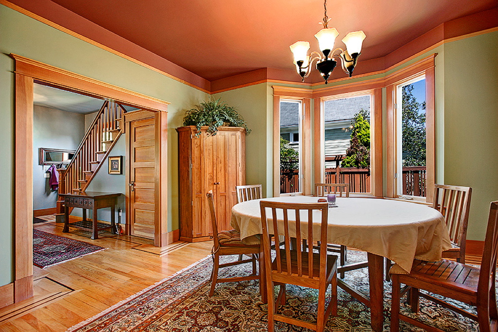
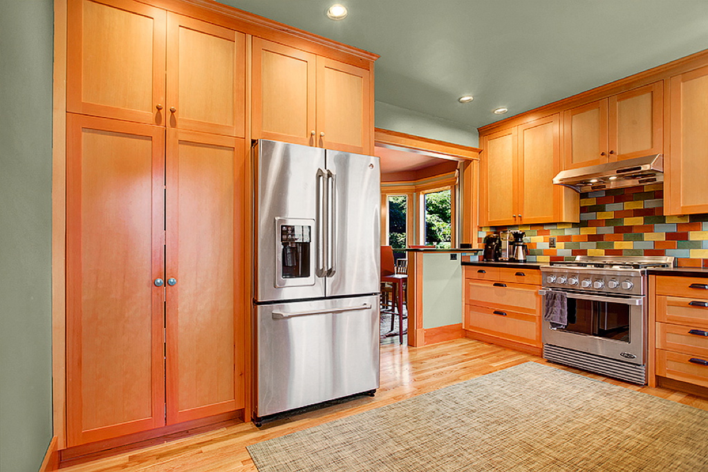
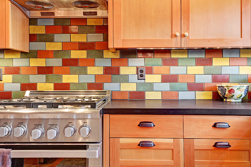
BUNGALOW DWELLING PALETTE™ CONSULTATION
This project began with a kitchen and bathroom remodel. With the kitchen update opening it to the adjacent dining room, the importance of a cohesive color palette and design throughout all of the communal spaces of the home was obvious.
With existing vertical grain fir trim throughout the home and new kitchen cabinets to match, already the Bungalow Palette™ emerged as the most resonant roadmap to guide this project. Existing rugs, art, and living room décor confirmed this as the right choice for this home's renovation.
All of the paint colors used in the home are from the 12 Benjamin Moore® Paint colors included in the complimentary Bungalow Palette™. This project used seven of the 12 colors in the palette for paint.
The other swatches assisted us in selecting all of the new hard finishes: bathroom and kitchen tile, and countertops.
With the colorful kitchen backsplash in a handmade subway tile, the palette helped us to balance this feature with new Roman shades in both the kitchen and living room. The swatches easily led us to incredible fabric choices that anchor the two ends of the home and connect the backsplash.


THE INTENTION
behind
COLOR IN SPACE
![]()
Nothing has been the same since awakening in 2008. My consciousness and body merged, and I have been learning how to integrate them ever since. My color work was where I was already in embodied practice, so the consciousness that has since opened up and has continued to expand to accompany it has proven to be my calling.
The Color in Space Method™ works in harmony with principles of nature, feng shui, and physics. In addition to specifying paint colors and sheens, we are inherently working with the energy of spaces and structures to create a balanced and supportive environment. Fundamental to feng shui is the common sense understanding that harmony and balance, especially with nature, have healing effects.
In 2008, I became conscious in an embodied way of the importance of this healing work. Not only for each of us as individuals—creatures of the Earth—but for the Earth herself even more importantly. With all of the decimation of the natural world, I feel obligated to create with the most responsible and dedicated intention in resonance with the Earth, as our home. She deserves for our creations to bring her nourishment and support in the same way we benefit from her creations. I have been experiencing the call get louder and louder as the years have gone by. Because of my own fear of sharing my truth and knowing, I have kept this intention behind the curtain. Being now in this time of Planetary Evolution, it is imperative that I acknowledge the dedication of our service.
The deeper intention of the Color in Space Method™ is to work with the energy of color designs to be in resonance with MOMMA Nature's color design principles, ultimately contributing to healing for Earth at This Time.
With Love,
Emily

Return Policy
With over 20 years of proven success in our methodology, our unique color palettes have been intentionally designed using the science of light and metamerism. We stand by our products 100%. If you are not fully satisfied with the way the colors harmonize and balance with each other, please let us know by emailing info@colorinspace.com or calling us at (206) 781-0296. Because the palettes themselves contain proprietary information and are paper consumables, we are not able to accept returns of these products.
If you are not fully satisfied with your ©Color in Space Chakra Image™ purchase, please return it in the same packaging provided within 30 days for a full refund.